A delicious new look through environmental design and branding for Scrappy’s Ice Cream at the University of North Texas Union.
Brand Identity | Environmental Design | Graphic Design | Logo Design
Project Challenges
The new state-of-the-art Union at the University of North Texas was opened in 2016, and with it launched multiple restaurants, including the ice cream and gelato shop known as Scrappy’s, a staple on the UNT campus since 2012. To appeal to students and their parents, the Dining Services Department required a more memorable dining experience with unique brand identities for select restaurants Flattop Grill, Sauté, and Scrappy’s Ice Cream.
Branding Scrappy’s Ice Cream
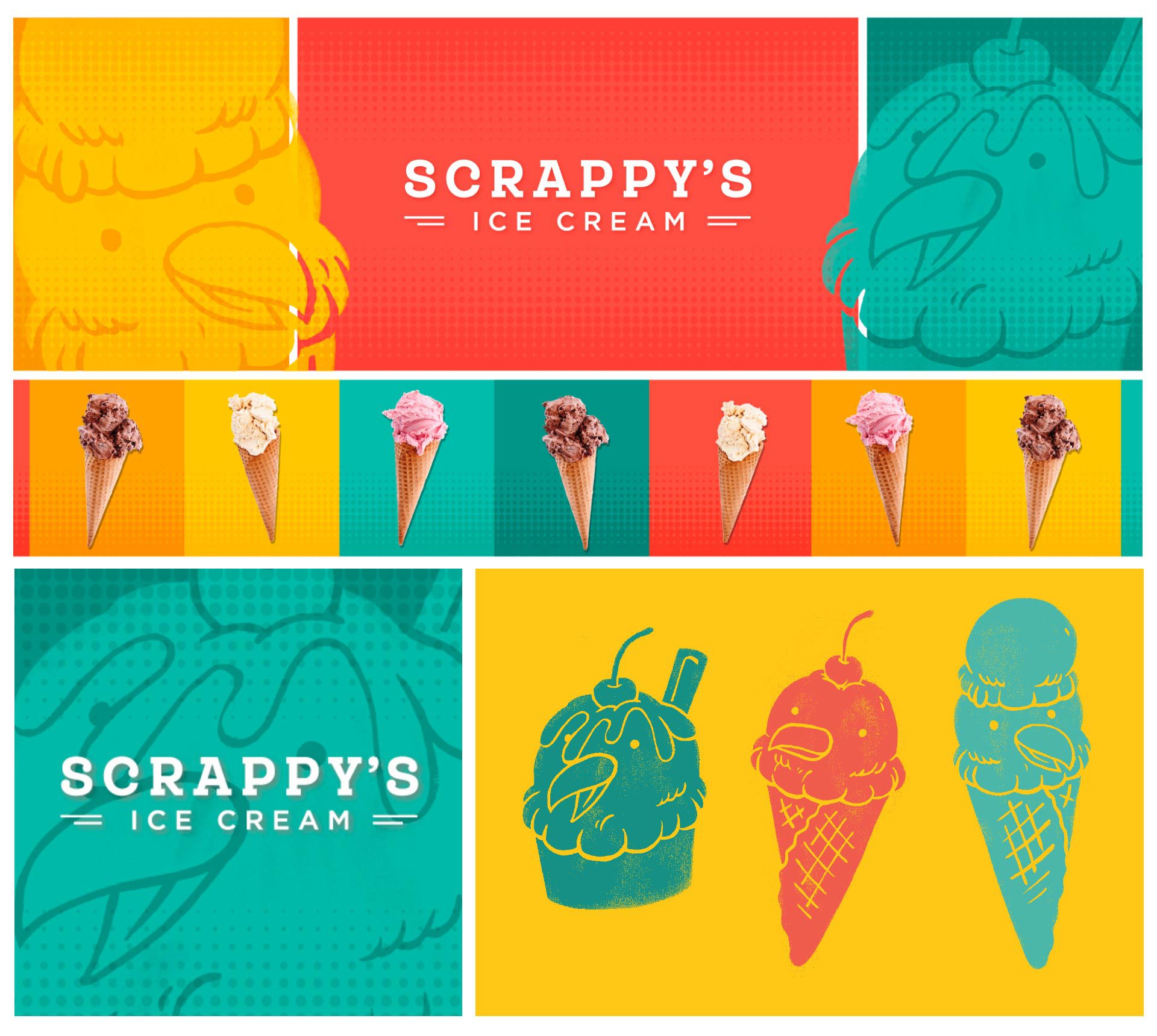
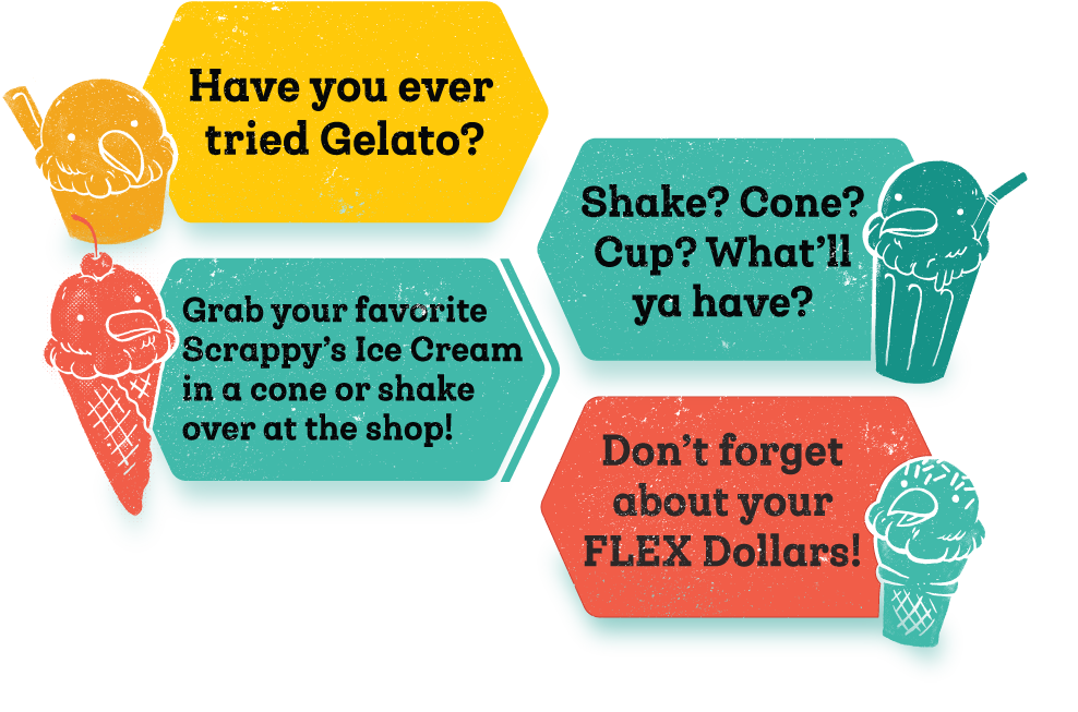
The original Scrappy’s Ice Cream shop had drawings of an eagle/ice cream cone mashup. To better understand the opportunities for improvements, we conducted a survey of students and faculty on the UNT campus which included visualizations of different design concepts. The results indicated that the eagle ice cream cone character had to stay. So, we created a small family of new and improved ice cream eagles.
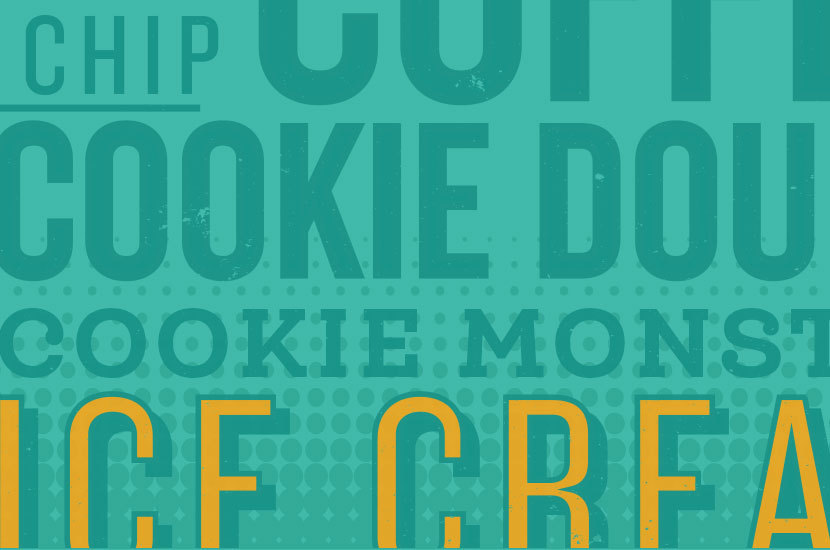
We built an in-depth moodboard with three unique design-style directions. Ultimately, the client chose our favorite: the Pop and Color direction. This allowed us to bring big swaths of color into the space along with fun pop art inspired typography, ice cream related photography, and illustration.
Environmental Design
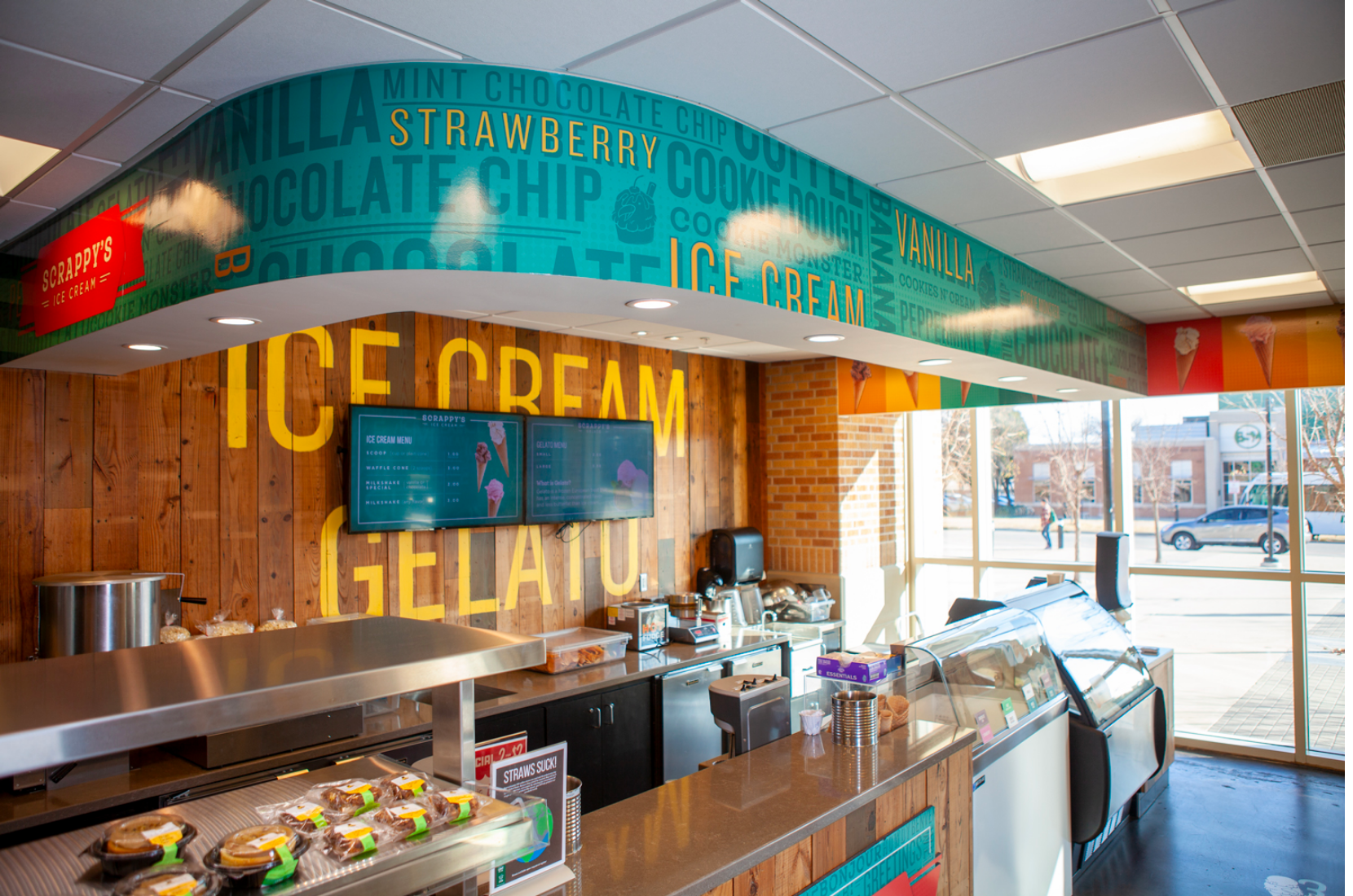
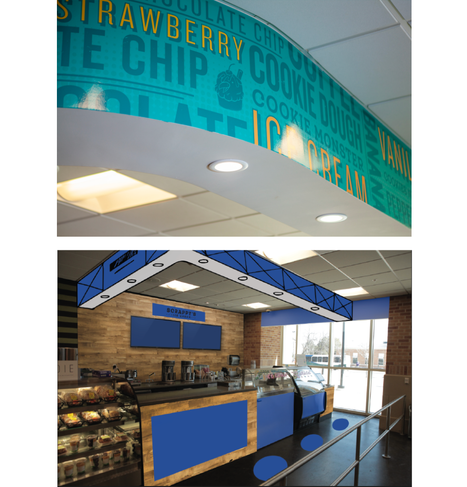
Scrappy’s is located in the corner of the main general store of the Union. It could be easily lost behind the fried chicken station and across from the Which Wich. This led us to design multiple physical touchpoints and contrasting elements for the shop’s environment. We suggested and designed an 18” tall soffit that did not previously exist in the space to wrap around the entire shop, provide inset lighting for the counters, and to draw attention to the corner from across the general store.
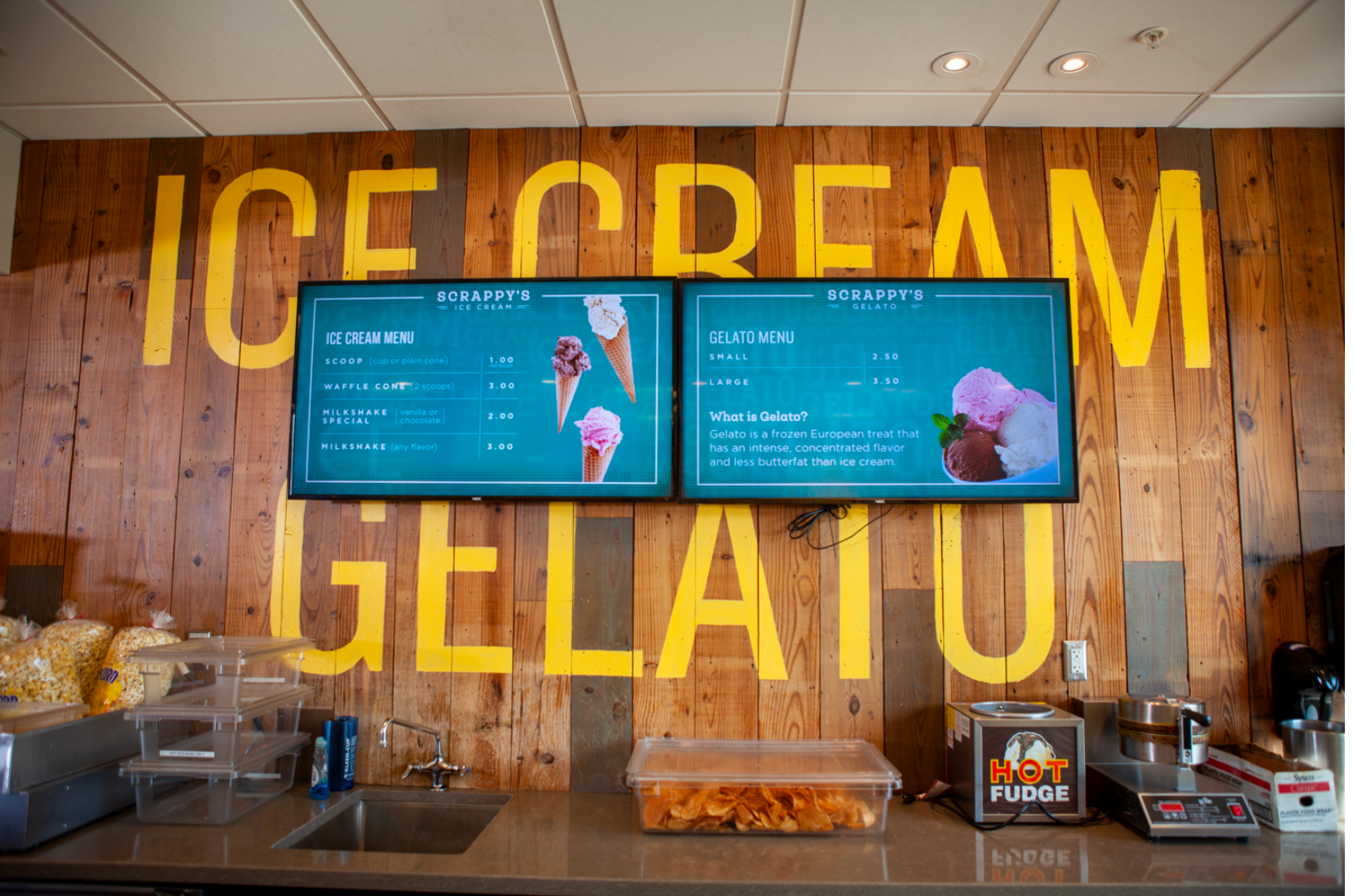
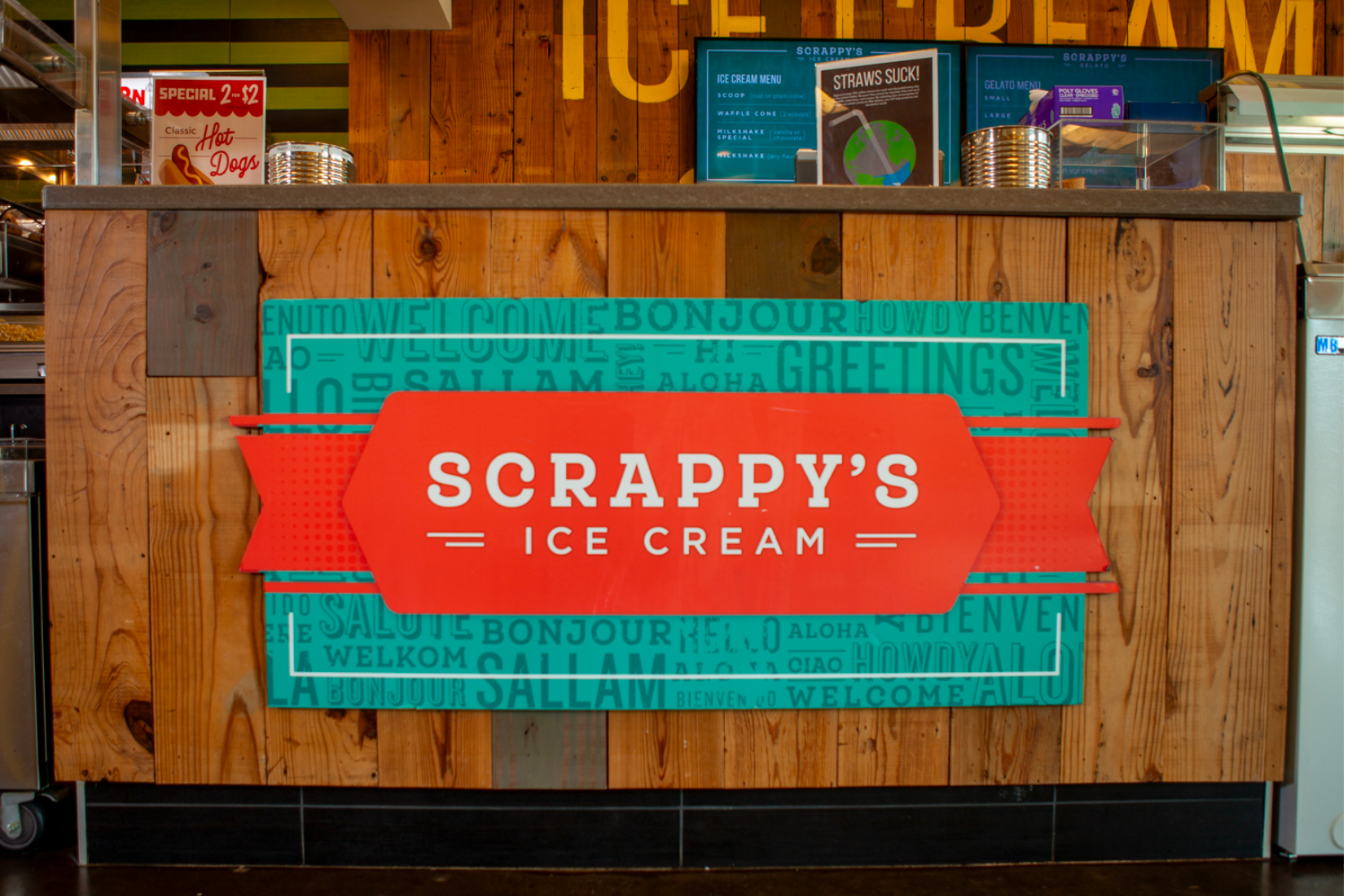
Additionally, we designed decals for the windows, floor, and ice cream counters to guide customers through the ordering process and provide energy to the shop. A wooden wall texture behind the menus separates the shop from the rest of the general store’s more generic walls, and the menus– two 55” flat screen tvs– protrude from the wooden wall and display digital ice cream and gelato menus with an animated background. Hand-painted typography on the wooden wall adds an additional detail.
