Introducing our new logo and brand identity.
We’re growing, we’re evolving, we’re building better brands. Whether from the ground up, taking over existing campaigns, or working in partnership with other agencies, we’ve built experiences and launched campaigns that’ve seen our clients succeed in ways that go beyond their expectations.
We’re proud of this work we get to do every single day.
Recently, we’ve celebrated 10 years of Square 205. 10 years figuring out who we are and what we do really well, like developing meaningful website experiences, creating engaging content, and managing high-performance digital marketing campaigns. We still have a lot to learn, but if I’m being honest, I think we’ve gotten pretty damn good at what we do.
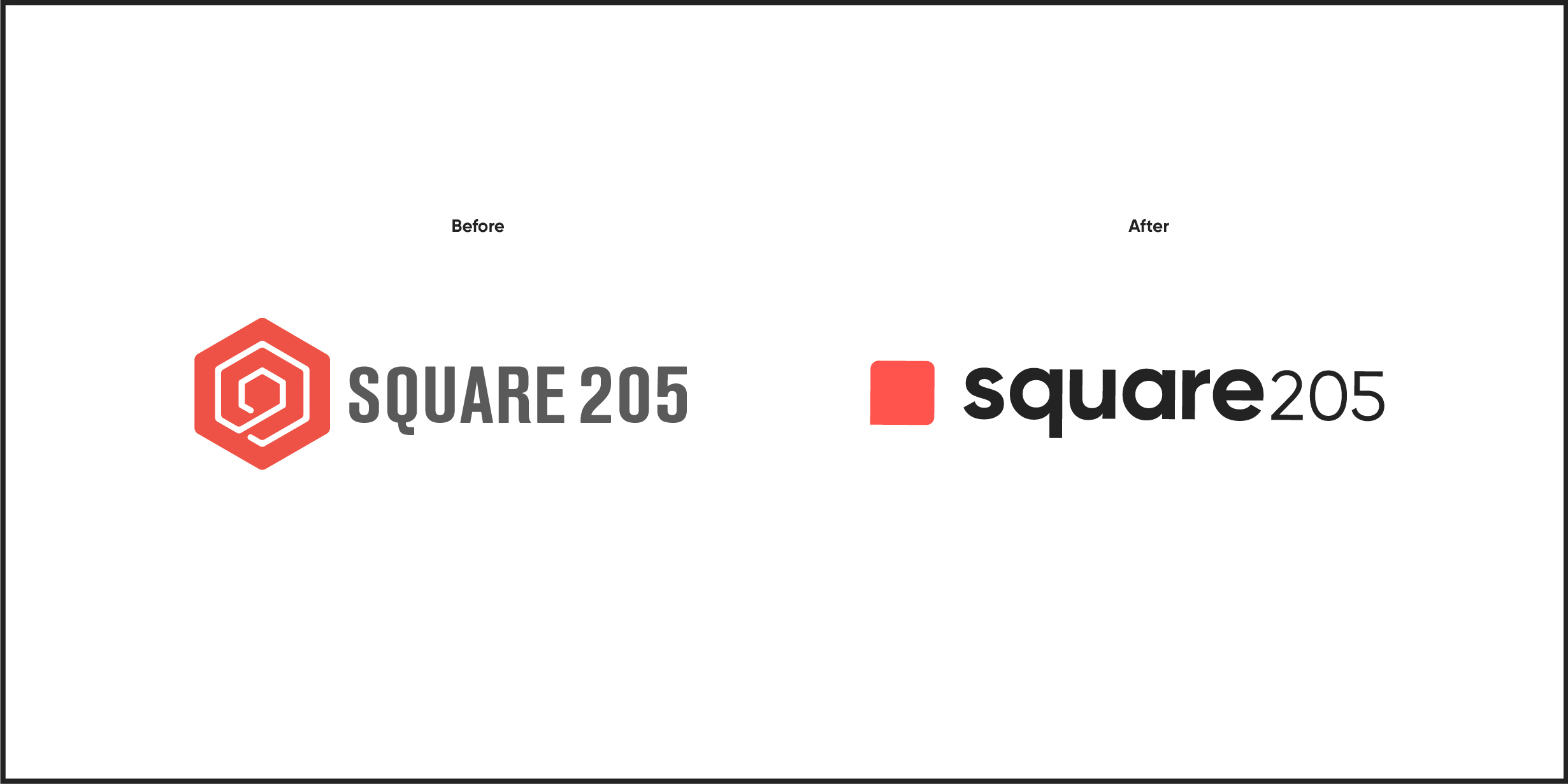
So, perhaps to celebrate, or perhaps to better communicate the quality of and the pride we take in our work, we’ve rebranded. It’s time we modernize to better represent the future of this human-focused digital agency through our brand identity.
We’re pretty excited to share this with you actually. Here it is:

The brand refresh is simple, it’s modern, it looks fresh, and it tells a straightforward story.
The name is still Square 205 though. It continues to tell the story of our passion for our local community and where we began, just off the square in Denton, TX.
We did explore whether a name change would be beneficial, but through thorough naming exercises, team dialogue, and internal discovery, we decided to keep our original name and honor our original roots. This also provides us with an opportunity to launch sister brands within the Square ecosystem with more highly-focused service offerings. An example is Square Studios, a media production company and a photography studio (coming soon!).
Alright, back to the new logo.
We’ve transformed our abstract cube logo mark into a simplified, modified square. It’s not just any square however, it’s a blank canvas. It symbolizes the creative freedom we bring to each and every project, allowing us to design gorgeous art, write alluring words, and to create human connection. All to serve our amazing client partners and help their brands grow and flourish.
Additionally, our new square logo mark represents and can be used as a speech bubble, further amplifying our message of creating human connections. We write, design, and shoot engaging content for our clients in order to create conversations that matter.
Through technology and proper messaging, the systems and campaigns we build can help bridge the gap between consumer and business. After all, we have plenty to learn from each other.
As new messaging and styles are being implemented across our brand’s touchpoints, we will continue our brand evolution with another gigantic undertaking: a new website. You’ve heard the age-old idiom, “The cobbler’s son has no shoes”. Well, we’re working as hard as we can to get some new shoes around here, in the form of a beautiful, and more importantly, a vastly more informative website. All without sacrificing any quality of service for our clients.
It’s going to be nice, y’all.

We’re a technology driven, partnership seeking, hyper collaborative, creatively evolving, human-focused digital marketing & creative agency. That’s the culture we’ve built and values we’ll work every day to reach. That’s also how we define our new tagline, The Shape of Digital.
Join us as we continue to pursue cutting-edge technologies and principles for each and every project. From website to design to social or search campaigns to photo and video content, we’re never satisfied and we’ll never let our work become stagnant. We hope our new logo, more vibrant colors, and new overall look shows our commitment to this concept. We hope you like it.

